Tuesday, October 27, 2015

Color Studies in Value

Monochromatic - 8x10 - Acrylic - Sloss Furnace

Analogous  - 8x10 - Acrylic - Sloss Furnace

Tetriad - 8x10 - Acrylic - Sloss Furnace

Photo Shop Photo of Values - 8x10 - Sloss Furnace
This exercise was a color scheme project.   In class we just finished doing stamp designs in dozens of color schemes and compositions.   Our task for this project was to take a photo and photo shop to limit values and crop to create simplified composition.    I chose the Sloss Furnace photo.   The most successful I felt was the Grey Monochromatic.   A grey (white & black only) scheme clearly defined the shapes and mood of the composition.    The Analogous (orange, yellow orange, red orange and red) remained defined and also I feel worked with the composition.   The Tetriad (violet, blue, orange, yellow) I felt didn't work.   Probably because they are equally spaced on the color wheel and because of that the colors are either dark or bright.   There was to much contrast.     The photo shop print was used and simplified to limit the shapes.     Because the goal was to trace exactly the shapes and identify a limit of four values, it helped the eye focus only more successfully.   In classes the instructor frequently talks about "squinting" to limited the amount of light in the eye to capture the basic shapes and values but that has never helped me much.   I have had instructors suggest printing off a black and white photo as a tool to identify basic composition shapes and values but this takes it a step further.   A great tool for painting.   

My first semester is a little over half completed.   Next semester I've signed up for drawing.   Wish I could just step out of time and go live on campus and just take classes.   It is consuming but I love it!

Sunday, October 18, 2015

Southeastern Pastel Society Members Online Exhibit 2015


Daffodil Morning - Pastel - 9x12 - 2014

 
Online exhibits are a fun way to participate in art shows.   Easy to do from your computer and usually pretty cheap.    I've entered a couple lately.   One thing that I need to invest time and energy into is taking a better photo of each of my paintings.   Frequently I just take out my iphone and snap a quick photo and crop.   I always know when I crop that it's not perfectly flat or straight.    I have a new camera and tripod so "no excuses".    I always have to send or upload a photo of my painting but I didn't pay as much attention to it as I should have until the online exhibits.   Since online is the only way the painting will be seen, its extra important to have the best photo that captures what the painting really "looks" like.   Another skill to work on!!

Color and Composition - Continued


Still experimenting with stamps.   I found the cream rubber block worked better than the pink.   The pink was just to difficult to cut with the speedball tool.   I also found that experimentation worked sometimes but if I wanted to use some of the stamp designs; I had to measure and adjust the stamp design.   I enjoyed the project but after about 15 of these I'm ready to "move" on.   Hopefully the instructor will find at least 5 that are acceptable.  I think our next projects will work with photography!!   Looking forward to that experience.

Saturday, October 17, 2015

More Stamp Designs


Stamp can be addictive.   You keep thinking you can make the perfect stamp.   Thinking in reverse is difficult however and when you stamp it seems to never have the effect you intended.   So far I've done lots of experimentation.   I'll start mounting a few.   Putting a frame around anything seems to give it more definition!!  

Thursday, October 15, 2015

Stamp Designs - Color/Composition


The project for this week was to cut a 2x4 inch stamp and create a variety of specific color combinations and composition types.    The stamps were hard for me to achieve detail.   I made about seven and got a little better along the way.   The color also was unpredictable.    This was basically an experimentation project for me.    Some were successful and others were not.   Definitely a fun art experience.   I can see how people get hooked on this medium.

Friday, October 9, 2015

Learning to Match Color

Color Match Exercise
This was my second color match exercise.   I wasted so much paint trying to match color.   Got close on most of them but some colors dried so much darker.   This exercise I thought had the most to offer in a learning experience.   It was a smaller project.   It had a limited palette to match (5-6 colors).  It still took considerable time to accomplish but a good learning experience.

Thursday, October 8, 2015

Color Theory

Color Mix - Yellow - Violet


Color Match


Color Theory - This week in class we studied color theory.  While I've always had a color wheel in all my art boxes whether I'm painting in pastel, acrylic or watercolor, I have to admit it just hasn't been a tool I've used a lot.   I know my primary colors don't get me wrong and I know how to mix the basic secondary colors; but this was my first time to have someone walk me through the entire color wheel and explain relationships.   Not sure I remember them all but I am beginning to understand mixing colors.

I love pastels but one of the drawbacks to pastel is "color mixing".   I've had lots of teachers spend lots of time talking and demonstrating choosing the perfect value but I never really "got it".   I think having been a beginner in retrospect, I would advise any instructor to take the "true" beginner through the process of experiencing the color wheel and mixing and matching colors.   It might take a couple of hours and maybe even a couple of class sessions to get the basics explained but it's worth it.   What was really valuable was mixing and matching the colors myself.     We used a good acrylic paint to create our colors.  

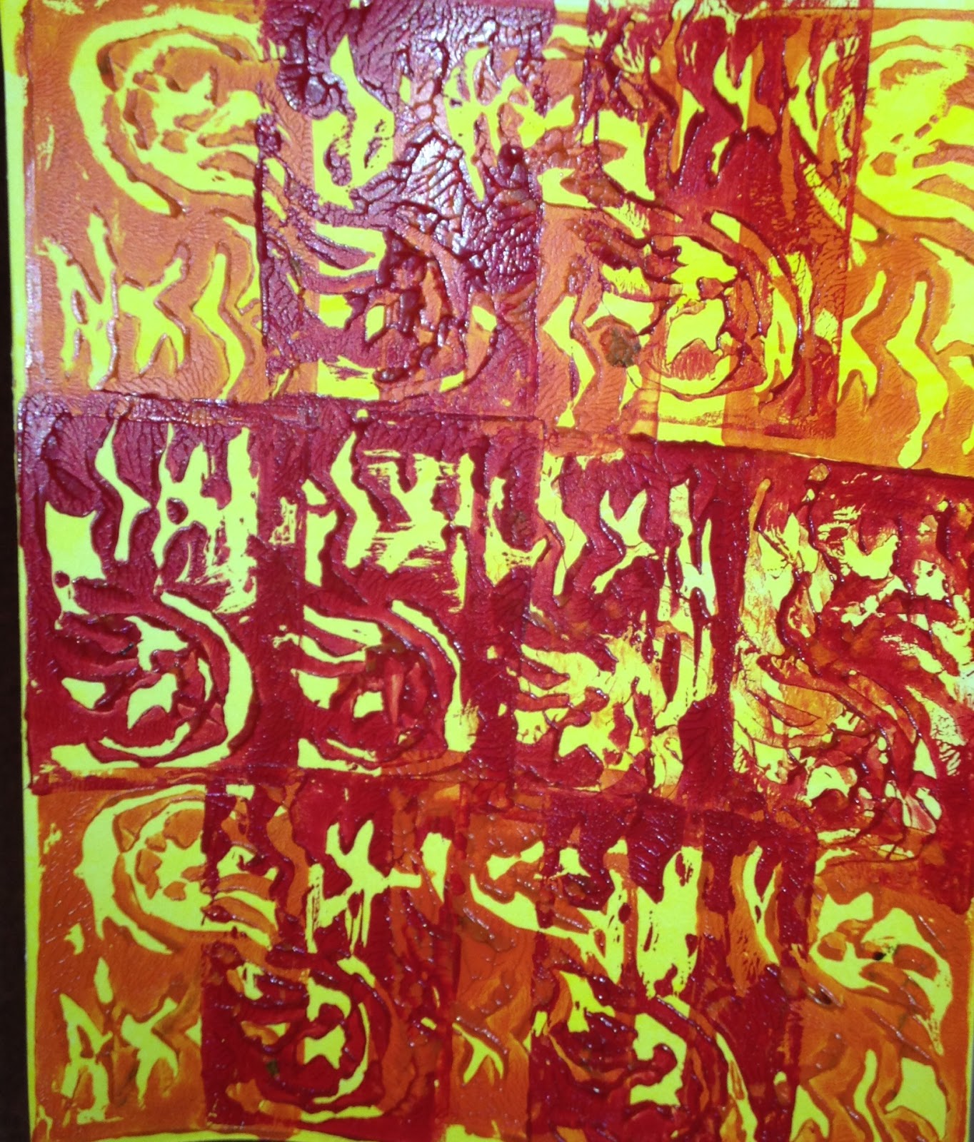
The projects above were the results of a couple of those mix and match experiences.   The first was taking Yellow(primary) and Violet (secondary) and mixing variations by adding white in 5 different quanities and then adding black in 2 different quanities to create tints and tones.  The second project was taking a photo from a magazine and circling 5-6 colors and then mixing colors to match the colors in the photo.

Definitely a process I need to repeat over and over to get it right and to beginning to identify the same values in various colors.   Hopefully this experience will generalize to my pastel painting over time.

Friday, October 2, 2015

27th IAPS Juried Exhibition - 2015 Webshow

"Mountain Morning" - 9x12 - Pastel - 2014
Art in the 21st Century - When you think of art exhibits you think of well lit spacious areas with beautiful art on the walls that wanders through a large rooms - people walking around with wine glasses in their hands and a string orchestra playing in the background.   That is not exactly the idea for the 27th International Association of Pastel Societies 2015 Webshow.   Until October 15, 2015 member artist of a participating pastel society can enter up to 5 paintings in this unique webshow.    Thanks to Karen Margulis, pastel artist for reminding me of this opportunity.   I've entered my five paintings into this juried webshow.   A long shot but I'll keep my fingers crossed.   I entered "Senoia Mill House Road", "Mountain Morning", "Winter Day", "Temple Barn" and "Quiet Stream".