Monday, February 29, 2016

Painting What You See

"Spring Daffodils" - 6x6 - Watercolor - February 2016
Spring is coming.....the daffodils are the trumpets announcing the good news.    I've been painting from reference photos for months and its good to have some 'real' things to paint.   Last week it was holly and this week it's daffodils.    To say 'paint what you see' is harder that it sounds.   Our mind and our eyes make sense of our world and give us short cuts to process all the stimuli around us.   We did an exercise in class one time where we drew without taking our eye off the subject.   I have to admit I cheated a little.   It was hard to draw and not look back and forth.    Needless to say it was not very good.    Later I saw a video where an instructor did the same thing but with an additional twist.   He first painted a wrench without ever taking his pencil off the paper and without looking away from the subject.   Next he drew the wrench from memory.   Finally he drew by looking 50% of the time at the subject and the other 50% of the time looking at the drawing.   The comparison was a) a drawing with 100% looking at the subject, b) a drawing with 100% NOT looking at the subject and c) a drawing with 50% looking at subject and 50% looking at drawing.    The last one was the most successful.   It's easy to get caught up in painting or drawing and to begin focusing only on the painting.    This 50% example helps me understand how important it is to keep a focus on the subject.    It also reminds me that drawing or painting from real objects/subjects and plein air are the very best ways to draw or paint.     It's a discipline and 'painting what you see' is something you have to work hard to accomplish     I've had three artist within the last few weeks say the same thing....'the painting never gets better than the drawing' ....or 'your paintings will never be any better than your drawing ability'.

With that in mind, I'm glad that I have been focusing on drawing for the last month.    I would add that drawing exercises the 'muscle' of focusing on what you actually see.   It's hard but worth the effort.

Friday, February 26, 2016

Learning Your Subject

'Needle Point' Holly - 6x6 - Watercolor - February 2016
My focus over the last few months has been to concentrate on learning some basics of drawing.   It started with a drawing class at University of West Georgia.   Our focus was sketch, sketch, sketch.  Sounds easy but it's actually hard to do.   Keeping my sketchbook by my living room chair helped me over the holidays.   Now I've drifted away and I think my next strategy will be to take a sketchbook and put one in my studio, living room, sun room, bedroom, etc.   I'm really anxious for some pretty weather so that I can do more sketching outside.     The other step was to take a illustration class at the State Botanical Gardens.   This required that we focus on the 'detail'.   We looked at things under a magnifying glass, we used a lamp to focus on shadow, we practiced, practiced, practiced value scales with graphite.   Then personally I decided to pick up the watercolor brush again and between trial and error, You Tube and practice, practice, I continue to learn some things.    What I learned in the watercolor above was to NOT use a charcoal pencil to sketch a watercolor and then put a watercolor wash on the paper.   While I was able to go back and work out some of the problems, I was left with some charcoal residue in the paint.    The other thing I've been doing is painting the same thing over and over.    I actually have done this before and a couple of my favorite paintings were ones that I painted dozens of time.   I'd sketch the composition, paint it in various color schemes and in different mediums.   It is a technique that really helps you get to know your subject.

Getting to Know Colored Pencils

'East Palatka' Holly - 11x14 - Colored Pencil - February 2016
Colored pencils have many positives.   Some of those positives include the following:
  1. the pencils can be left out and don't take up a lot of space
  2. pencils don't leave a mess
  3. pencils don't require clean up like paints
  4. no issue to leave out around children/grandkids
  5. easy to sharpen to points
  6. mix on the paper
  7. allow a wide variety of strokes
  8. produce nice artwork
  9. allow for a wide variety of values
With these positives being said, I did find the medium to be time consuming and tedious.   On this one drawing I spent the better part of a week sketching, completing in graphite, sketching and completing in color.   I thing it's perfect for the project our class was working on - natural science illustration.    It is a medium I will try again.  

Tuesday, February 23, 2016

Continuing With Pencil Drawing

'East Palatka' Holly - 9x12 - Graphite Pencil - February 2016
This weeks assignment in my Natural Science Illustration Class is a pencil sketch of a 'East Palatka' Holly.    This is not finished yet but I thought it would be good to take a photo and post so I could see more clearly where I needed more dark shading.     Here are the steps in this assignment.   Our assignment was to draw thumbnails sketches of various composition of a still life of the holly.   We then use a proportion scale to determine the % need to enlarge the drawing to at least 9x9.     We then traced the enlargement onto tracing paper and then traced onto a hot press paper.   Our task was to use a magnifying glass to search for all the detail in the veins, etc.    It's only after completing this drawing that we are to do a color recipe card for the colored pencil drawing.   I've worked hours on the graphite drawing already so this is turning into quite a project.   I will say that the more work on the front end creates a better results on the back end.


Monday, February 22, 2016

Landscape Design

It's been a while since I completed a landscape plan.   This didn't copy very well but I decided to post it anyway.   Several years ago I took courses at Chattahoochee Tech in Landscape Design.   It was great fun and I completed my certification.    I've applied a lot of what I've learned but had gotten use to the Dynascape software.    I was asked to do a butterfly garden design for the local senior center.   My student license for Dynascape had expired so I was back to hand drawing.    I loved doing these in school.   I'm finding that all my experiences since retirement have been similar and have built on each other whether landscape design, painting, drawing, etc.   This was a fun project.

Sunday, February 21, 2016

Less is More

"Deserted Wagon Wheel" - 9x6 - Watercolor - February 2016
After a sleepless night and a good cup of coffee, I decided to go back to my mini paintings.   They are quick and feed my need to capture a subject and move on to something else.   This field was at a Georgia farm I visited last year.   I was taken by the rocks, wagon wheel and the old tub scattered under the trees.   So much the stereotype of an old country place.   The remnants of the past are abandoned without regard of the landscape.    I think it actually gives it some character and speaks to the farm's 'past'.

Sometimes you have to look for the one thing you like?

"Homestead" - 9x12 - Watercolor - February 2016
I'm discovering that I'm an impatient painter.    I love mediums that give you instant gratification.    Those are pencil, charcoal, pastel.   I love watercolor but we have a love hate relationship.   When I started this painting I did the sky first.   I loved the clouds and probably should have left the painting for a few hours and came back.   BUT....I just couldn't step away.   Maybe the trick is to start several at one time and move back and forth.    I've got a colored pencil assignment for a class this week so that will help me get away from watercolor for a few days.  


Through the Gate - Working with Watercolor and Hard Pastels

"Through The Gate" - 9x12 - Watercolor and Hard Pastel - February 2016
Some days I just can't sleep and I pick up my paints!   After three disasters I finally stopped on this watercolor and added a few pastel strokes and decided I could step away.    There are days when it seems like nothing works and the harder you try the worse it gets.   Tomorrow I'll either add some more pastels or toss them all in the save to paint on the back.    That is the nice thing about watercolor, you can always get double out of the paper by practicing on front and back.    Sometimes when I go through my stash of "throw aside" paintings, I find something that I like.   I find it hard to throw away anything good or bad.  

Friday, February 19, 2016

Water Mixable Oils - A Discovery

After making a mistake of buying water mixable oils instead of watercolor and then actually trying to paint with them like they were watercolor - I decided to find out a little about the medium.    Water Mixable Oils is a new oil paint that can be cleaned with water and does not require turpentine.    For those that hate the smell of solvent and don't like even the unscented in their home studio the water mixable is an alternative.    While the write ups all say it can be mixed with water, I found that it took some work to make it work.   Of course I was also using watercolor at the time but I found the paint to be sticky.   The paint can be used like regular oil paint.   The main difference is clean up which can be done with soap and water.   Oil painting purist have mixed reviews on the medium but it seems to have captured a place among some artist.    By accident I did a painting with watercolor and water mixable oils.     What was frustrating was getting the oils in my watercolor palette.   I tried to clean it with warm water.   Guess I'll see if it was successful next time I try a watercolor.  

Oil painting is something I've had limited experience with and because of my allergies I've not considered learning the medium.    This accident of using the paint on a watercolor however has got me thinking about trying the water mixable oil.     I'll paint on a canvas and not water color paper....and maybe it will work better :)  

An Accident of Mixed Media

A Farm Road Walk - 12x9 - Watercolor and Water Mixed Oil - February 2016

Sketch for "A Farm Road Walk" - 5x7 - Pencil - February 2016
Some days I don't know what planet I'm on and what I am thinking!!    The morning started good with some colored pencil drawing.   I was feeling good about my drawing progress and decided that instead of doing a thumbnail sketch; I would draw a sketch with a little more detail so that I would know where I wanted to take the watercolor I was starting.    I had been to the store to purchase a few paints to added to my watercolor.   I decided rather than mixing the colors I would purchase a medium grey, black and a white.   There were rows and rows of paints.   I looked and looked and finally decided on a Winsor Newton.   Today I started the watercolor.   I had great under washes and was feeling good about the composition.   I decided to make some modifications to add rocks on each side of the road.   I also wanted to add shadow under the fence and behind each fence post.   The paint just didn't mix well.   It seemed sticky and even adding water I had to really work on mixing the paint on the paper.     After a while I picked up the new tube of paint and discovered it was a "water mixing oil"!!!!!   Good grief....I had just spend about an hour doing rocks and shadows throughout the painting so by now I had little streaks of the water mixed oil in my watercolors.  

Out of this chaos was born "A Farm Road Walk".    While the effect is not recognizable as oil or watercolor, I decided that I kinda liked the painting.    I'll redo it later as a watercolor but for now this is today's "Painting My State" painting.    I've been doing a series of paintings on "Painting My Town" and decided to expand to "Painting My State" since so many of my reference photos and paintings are of places in Georgia I've visited.   This scene is from a farm around Temple, GA.

My lesson for today - read the label carefully when purchasing anything ....especially paint.     Now what will I do with water mixing oil???

Still Life - Colored Pencil on Brown Paper

"Golden Delicious" - 6x7 - Still Life with Colored Pencil on Brown Paper - February 2016

Color Recipe Card for Apple Still Life
This week's assignment was to complete our three vegetable/fruit still life and to continue practicing 5 value shading.    Our instructor gave us some brown paper last week and I decided to try out my colored pencils on the brown paper.    The colored paper really helped give some depth to the drawing.    This project gave me more experience at mixing color on the paper.   This weekend our assignment will be drawing holly.   If you love to draw or if you are an artist who hasn't done much drawing, I highly recommend this class or any drawing class.    I wish I had taken drawing classes early on in my art experience.   The practice at "seeing" and "drawing" values really gives your eye a workout.   It's easy to miss the many values of an object and also the many colors in "one" color.   O.C. Carlisle is our instructor.   She teaches the four week class at the State Botanical Gardens in Athens, GA.   Check out her website for her outstanding artwork.   www.carlisleillustration.squaresspace.com.

Wednesday, February 17, 2016

Pencil Drawing - Still Life

Still Life - 10x14 - Color Pencil - February 2016

Still Life - 10x14 - Graphite Pencil - February 2016
The assignment this week for Natural Science Illustration was to draw a vegetable - fruit still life.   We sketched several thumbnail compositions.   After choosing the best of the composition, I did a proportion scale and enlarged the sketch by 200% to create a approximate 9 inch sketch.   The enlarged sketch was then transferred to 140# hard press paper.  The shadow made the drawing a little over 9 inches.   The task was to shade and shadow the drawing as a first step.    Afterwards I selected colored pencils and created a "color recipe" card.   Then the color drawing was shaded and shadowed.

Color Recipe Card 

Farm Barn Road

Farm Barn Road - 10x14 - Watercolor - February 2016

This barn and shed was located around Temple, GA.   When you live in the suburbs and with congestion it's hard to remember wide open spaces, but there are still many in Georgia.   Miles of open fields and farms are around every turn.   Many are falling down and deserted but there are still family farms where people are hanging on to the land even if they don't farm the land.

Tuesday, February 16, 2016

'Potter's Stream' - 10x14 - Watercolor - February 2016

"Potter's Stream" - 10x14 - Watercolor - February 2016
This watercolor is a bigger version of the 'Mountain Stream' which was painted from a reference photo of Mark of the Potter.    Purples and Greens seemed to be the interpretation for today.    Water reflection and shadows are interesting to paint.   I've painted through my watercolor paper so today will be supply purchase day.   I'll probably get some watercolor paints to fill out my palette also.   

Seems by show in May 2016 will take on a bigger scope than "Painting My Town".    I may have to have a section of painting my town and one for "Painting my Georgia Home."    So many of my reference photos are from the North Georgia Mountains and Middle Georgia.   

Sunday, February 14, 2016

Mountain Stream

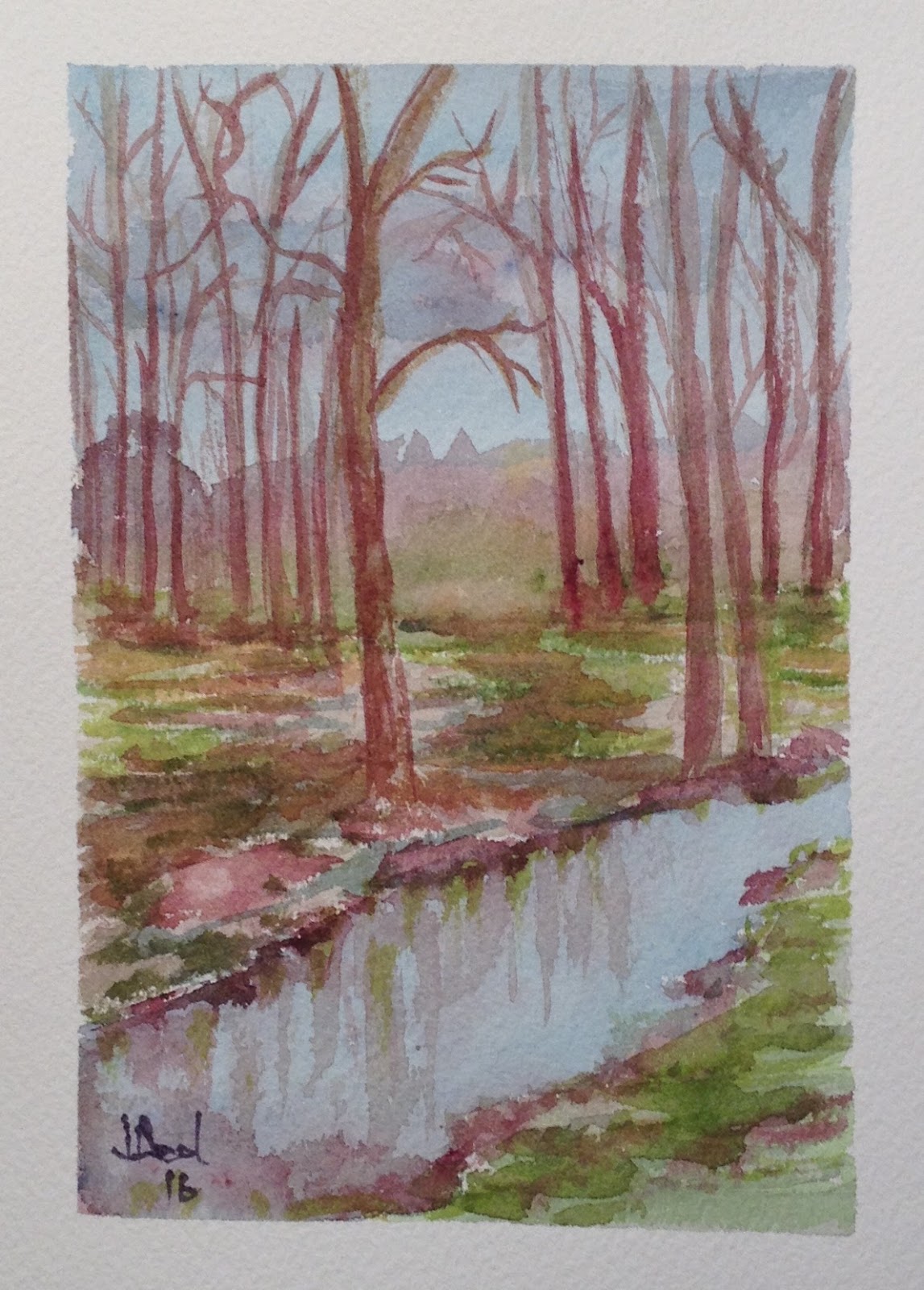
Mountain Stream - 5x7 - Watercolor - February 2016
One of my favorite places is the area in Clarksville, GA around Mark of the Potter.    I've done several paintings of the old mill that now holds the Mark of the Potter.   This view is down stream and it's beautiful anytime of the year.  

Today I cleaned my watercolor palette and put in all my favorite colors.   I was missing burnt umber but the other colors are raw umber, burnt sienna, raw sienna, yellow ochre, aeolian yellow, new gamboge, cadmium red, alizarin crimson red, rose milder, violet, cobalt blue, cerulean blue, ultramarine blue, thrall blue, perylene green permanent sap green, winter green.


Friday, February 12, 2016

Drawing with Shading

Basic Shapes Drawing  - 11x14 - Graphite Pencil - February 2016
My Natural Science Class at State Botanical Gardens started last week.   Our first class was spent doing thumbnails of various arrangements of basic objects.  A lamp at 45 degree angle was used to create the shadows.   We had a cylinder, cone, cube and sphere.    After sketching several thumbnails(four to a 8x10 page), we used a proportion wheel to find the percent enlargement needed to make the drawing a 9x9.    We then traced the outline on an 11x14 hot press paper(#140).    I took a photograph of the arrangement before I left class so I could work on the shading at home.   What surprised me was the cast shadow I missed.    There was actually a much longer shadow that faded off the right side of the objects.    "Draw what you see" is harder than you think.    O. C. Carlisle is teaching the class.   She shared an article from the Journal of Natural Science Illustration.   One of the quotes from the President of the Guild of Natural Science Illustrations stuck with me.   "...we can learn to see by learning to draw."   

Tuesday, February 9, 2016

Painting My Town

Downtown Crossing - 5x7 - Watercolor - February 2016
Every small town has a railroad crossing.   Since the railroad goes right through my hometown, my town has several crossings.    To bad several years ago the old train station was torn down.   Several of the surrounding towns saved that little bit of their history.    Front street or "Broad Street" is designated a historical location.  

Monday, February 8, 2016

Christmas Revisited!

'Christmas Welcome' - 4.5x4.5 - Watercolor - February 2016
One of my favorite places at Christmas is my church.   The decorations are always so beautiful and inspiring.   The simplicity of the wreaths on the front doors is always one of my favorite things.   I'm painting in small minis again in watercolor.   Several washes and some limited detail seemed to capture the welcoming doors.

Painting Memories

'Afternoon Reflection' - 5x5 - Watercolor - February 2016
On a  trip to Callaway Gardens a couple of years ago,  I took a photograph of the lake by the chapel.   I've always loved the photo but never got around to painting it until today.    The lake is a very peaceful place.   My favorite time to visit is around 4:00 p.m. in the afternoon.   That is the time an organist plays in the chapel.    I love to sit away from visitors on the top of the hill overlooking the chapel and just listen to the organ sounds mixing with the sound of the water rushing below.   Truly a heavenly place.

Sunday, February 7, 2016

Mountain Pine Forest


'Mountain Pine Forest' - 5x5 - Watercolor - February 2016

Today I'm continuing to paint some 'mini' watercolors.    I love working in square.   The look of the painting is just very different.   This is a simple pine forest.   In this painting I painted the sky in first. Then i added some yellows and orange as a wash on the bottom.   Then came the pine trees.   Watercolor is not very forgiving.    It forces you to be patient.   While I like this painting, it would have been better if I'd left more of the white paper and yellow-orange under wash.

Friday, February 5, 2016

Tree in the Field


'Tree in the Field' - 10x14 - Watercolor - February 2016

Sometimes the simplest things are the most beautiful.   Love the image of this lone tree in the field.   I'm really having a hard time getting away from watercolor.    Still enjoying painting daily.   My new studio set up has helped keep me active.   Watercolors really last a long time.  I'm still trying to paint my small palette clean.    Maybe this weekend I'll do some small studies of clouds or trees to try to use it up.  I'm anxious to reset my palette.

Tomorrow will be a totally different experience.   I'm taking a Natural Science Illustration class at the State Botanical Gardens.   So this weekend it will be graphic pencils and charcoal.   Our first assignment was to do a 5 step and 10 step gray scale.   The 5 step was pretty easy but the 10 step was a challenge.   More to come on this experience.

You Tube

You Tube is full of tutorials on everything from installing a spark plug to painting with watercolor.   Obviously today I'm listening to the painting with watercolor videos.    Sometime it's just fun to not think and just follow.   There were several things to learn today and some refresher items.   The tree was actually torn out of masking/painters tape and placed on the paper first.   Two rock shapes were also torn and placed on the paper.   Then the painting of the sky was a wash from dark to light.   The mountain was just a pale hint of color.  Then a crunched paper towel was used to dab reds, greens and yellows into the tree.  Add a few branches and dab some more.   I removed the tape and painted the left shadow on the tree.  Dropped in some dark color and scraped with an old credit card.  Then the grasses were put in in several colors.   Remove the tape from the rocks and add some dark shadow.  

The thistle was done by painting a square with water.   Then with sap green, yellow ocher, burnt umber paint was swirled around the edge and on the wet square.  It created a marble effect.   Then a dry paper towel rolled in a circle removed the paint for one flower.  A damp brush lifted the paint for the stems and the other bud.   What was unusual was after it dries you paint with color pencil the flowers.    I didn't have the right kind of pencils but them did pretty good.   At least it turned out well enough to understand how this could really be a fun way to paint flowers.

Thursday, February 4, 2016

Downtown Alley

Downtown Alley - 5x7 - Watercolor - February 2016
Every small town tries to reinvent itself and my hometown is no different.   But this was actually a pretty clever move to turn a downtown alley into a walking street.   Grant it...there is not much on the alley but during festivals and downtown art events it's a great place for people to walk and gather.   This is another of my paintings of "Painting My Town". series.  

Through the Gate


"Through the Gate - 5x7 - Watercolor - February 2016

Love these small 5x4 minis!!   Gives you a chance to paint a lot and not feel like your just burning up paper.   Think I'll start putting these on note cards.    A great way to send a little something without a lot of fuss.   This is another of the paintings from a photo shoot in Temple, GA.   My friend has a house at the end of this path through the gate.

Country Home

Country Home - 10x10 - Watercolor - February 2016
Nice trees and setting for this country home around Temple, GA.   I saw a new tip for a palette this week on You Tube.     Put your paints in the wells of your palette and write in marker the names of the colors along the outside edge.    I'm using up my current paints on my palette but plan on implementing this.   Frequently I forget the colors I'm using.   I usually keep the current ones in a baggy until I tire of that color scheme or I add a color based on the painting.    The label method will be easy to do and should help keep things organized.

Wednesday, February 3, 2016

Back Road Farm

'Field Farm' - 5x7 - Watercolor - February 2016
Still going through photos I took last year on a trip to Temple GA.   What I've learned is I really need to go through photos after each trip and print out my favorites and keep in a file box.   That way I have inspiration at my finger tips.   I tend to print off a bunch and scatter them on my work table and go through them each day.    This works usually and I frequently go back again and again to paint the same scene.   My favorite is to paint the same scene in different mediums.   I've been doing charcoal and watercolor.   Tomorrow I think will be a pastel day!!

Barn Reflection

Barn Reflection - 11x11 - Watercolor - February 2016


Suggestion is powerful.    This study on a barn leaves a lot to the imagination but I love the loose colors and imperfect lines.   I tried a different approach today and enjoyed just free painting.   I actually love the white paper showing through.

Forest Stream

Forest Stream - 5x7 - Watercolor - February 2016

Today I am revisiting photos I took last year on a outing to Temple, GA.   My printer is not working right now and all my photos are printing grey tones.   I find that its probably better than a color photo because you see more shapes and shadows.   I use to print a color and a black and white, so I've used them as reference before.   I'm enjoying my watercolor.   Since I paint small, I'm not having to wait long periods of time for them to dry.   I think what I may try next is starting several paintings at one time.   That way it is easier to "wait" for things to dry between.  

Tuesday, February 2, 2016

Farm Yard

Farm Yard - 5x7 - Watercolor - February 2016


Several Years ago I went on a photo trip to Temple, GA.   We say lots of barns and I loved a house that had a pasture as it's side yard.   They just let it go with the collection of farm debris that collects. I've sketched with scene several times in pencil and decided to do a watercolor study.

Monday, February 1, 2016

Painting Loose

Roses - 5x7 - Watercolor - February 2016
After I did this, I wished I had painted it bigger.   I was trying some under washes and layering on detail at end.    I got to impatient.    Rule #1 - watercolor cannot be rushed.    In several classes I've had instructors use a hairdryer to dry the painting between layers.    Recently I watched a You Tube video and heard someone swear that the colors were different if you don't let them dry themselves.   Paint - wait - paint - wait - paint - wait - paint.    Tomorrow I'll redo this painting and be more disciplined.